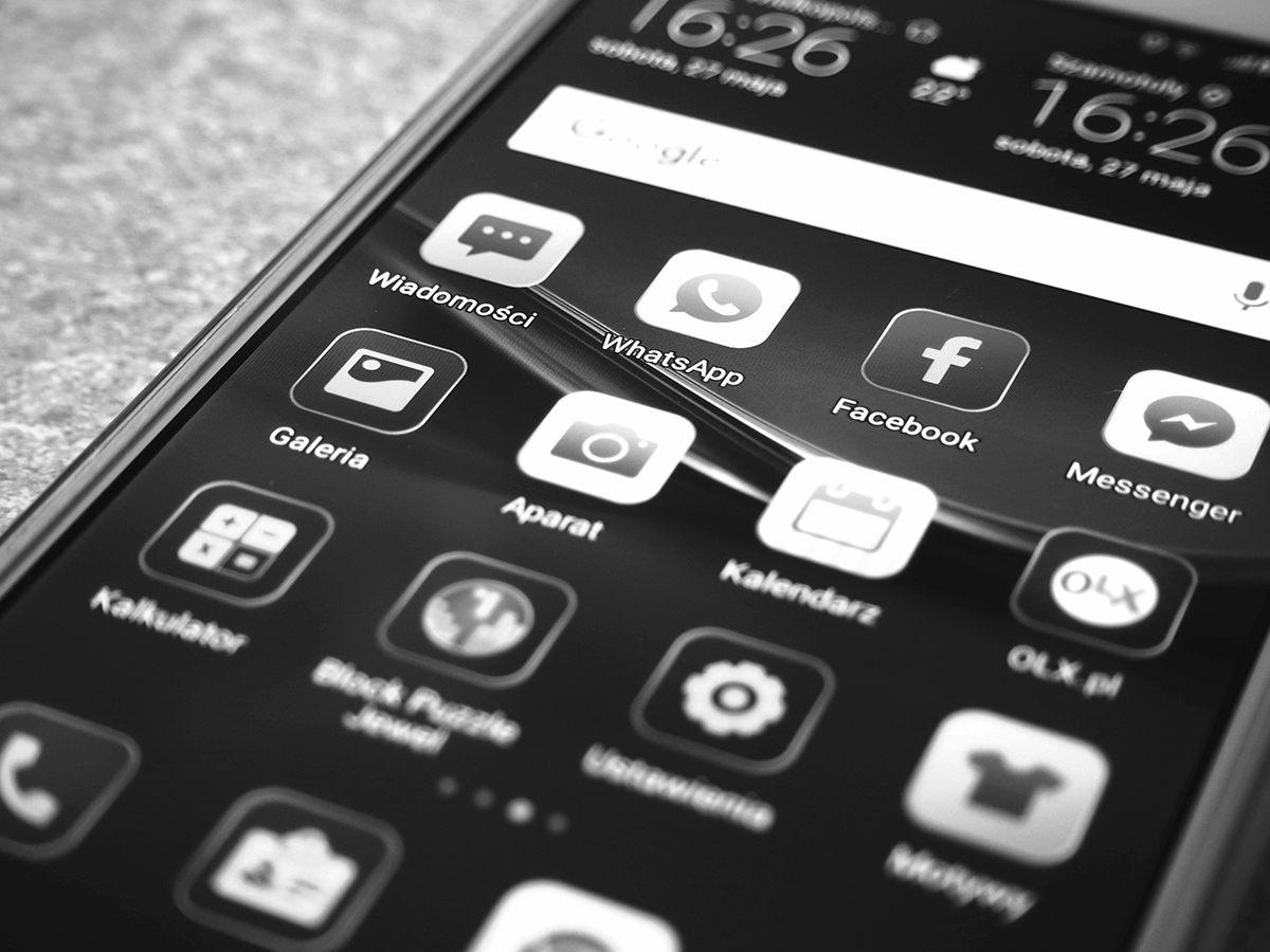
The next Enterprise App FAQ deals wit “Holo” Android Apps.
I was surprised most have never heard of it. So I found an Android Holo Expert named Yousuf Haque who is quickly rising up the Android charts to answer this.
What are Android Holo Apps?
To start answering your question, Holo (short for holographic) is the look, feel, and design language for the android platform starting from 4.0 (Ice Cream Sandwich) up until at least 4.3 (Jellybean.)
It is an expressive language that allows a user to learn about the system based on affordances given off by certain interactive elements. For example, buttons all look pretty much the same, the new hamburger menu/navigation drawer all works the same way. It’s a design language developed by android that allows users to jump into new apps and use them without little learning.
Another thing the Holo Design Guideline promotes is visual consistency across the android platform. You can go into the app store and download a handful of applications and while they each have their own unique color palette and feel, their icons and affordances are usually the same. You can tell all these apps are part of the android family.
Enterprises: Should we go holo apps or go home?
Short answer: probably but not necessarily. As Matias Duarte, the Director of android user experience explains in his google+ post following the Yahoo weather app update, one should follow the android design guideline (and the visual aesthetic of android, aka holo) for the sake of consistency, easing frustration, and reusing learned behaviors. However, if your new version of an interaction, or an alternative visual scheme brings value and uniqueness to your application without frustrating users or completely clashing with the android platform’s look and feel, by all means, go ahead.
Android is meant to be extensible to users via customization and tweaking. It’s design philosophy is also meant to be extensible to designers and developers through their own creative expression. Just keep in mind, as you introduce new elements to your application, users might have to re-learn the interaction. If users spend more time trying to find buttons, or figuring out how to do stuff rather than doing that stuff, you might have to re-think your design decisions.
Your thoughts on Light, Dark, or Both?
It’s entirely up to you and user preferences. Actually, you should probably pick one as a default but provide the option to switch to the user! You could also come up with your own holo themes through android xml theme files. It really depends on your preference and how exactly you want your application to look. I do want to mention that battery life on a device is important. If your application is going to be running for long periods of time without the screen being turned off, look for darker colors: they’re easier on the battery (white requires all 3 subpixels of red, green, and blue to be turned fully on while darker colors do not), and its usually less harsh on the eyes, especially in a non-daylight outdoorsy setting.
A big thanks to Yousuf and keep an eye on his latest builds on Google+